Project Overview
The goal of this project was to use what I learned from the Udacity User Experience Designer Nanodegree course and apply it to a design problem of my choosing.
I decided to make an application that helps people make recipes with online grocery shopping.
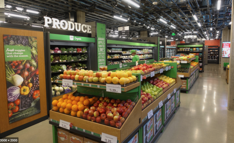
These platforms have become increasingly prevalent due to Covid-19 and people not wanting to shop in stores.
I designed an experience that uses many strategies from platforms including Amazon Fresh and Instacart since I would regularly use these services and was familiar with the shopping process.
I wanted to design an application that allows users to easily create, save, and share recipes and directly order the necessary ingredients.

User Interviews and Testing
I recruited participants for an interview study.
I conducted 30-minute in-person interview to gather in-depth qualitative data.
The participants in this study have used Amazon Fresh and Instacart within the last month.
I found that some essential reasons for using online grocery shopping platforms was for ease of use, convenience, and saving money.
Their current pain points were mostly concerned about the transition from in-person shopping compared to online alternatives.
Most cooks use online grocery shopping to buy and prepare for recipes they will cook that week.
They prefer to interact with the existing digital products through desktop devices rather than mobile devices.
The current online platforms are not mobile friendly and usually difficult to navigate on a cell phone.
A major pain point for cooks is finding new recipes and integrating that into the shopping experience.
Chefs want to be able to share recipes with their friends and voiced that having a social feature on the app would be very useful.
Many of the people I interviewed enjoy watching cooking videos and I took this knowledge to include cooking instruction videos in each of the recipes.
I gained consensus that users need another online grocery shopping product. I used these insights to develop my application Munch.
Low-Fidelity Designs
I sketched designs of four screens of my product based on my research findings and the design principles I learned.
I used user interviews to build my understanding of – and empathy for – potential users.
The main purpose of my sketches was to brainstorm ideas and possible user journey maps.
I designed four different gray scale layouts for my product including a log in page, home page, recipe page, and profile page.
I kept the initial designs of my platform low-fidelity so I could quickly ideate and get feedback.
I initially started with a desktop layout since current platforms have optimized their flow for this method of interaction.
I soon iterated these designs to a mobile view.
The user testing interviews gave me insight that they don’t feel comfortable using their phones to shop for groceries and this was a pain point I wanted to address.
I will now describe my initial though process and ideal user flow the website.
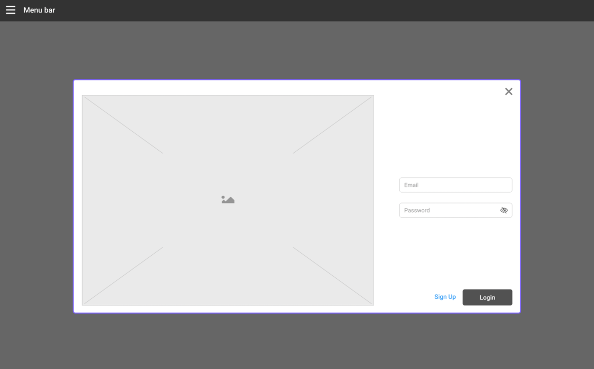
The log in page for my platform used a simple email and password method to sign up.
I would have a picture of a popular recipe on this page to get the users interested in what recipes they will cook.
It is important for users to create an account for Munch since this will allow them to use many of the features including editing recipes, saving recipes to their cookbook, and sharing recipes with friends.
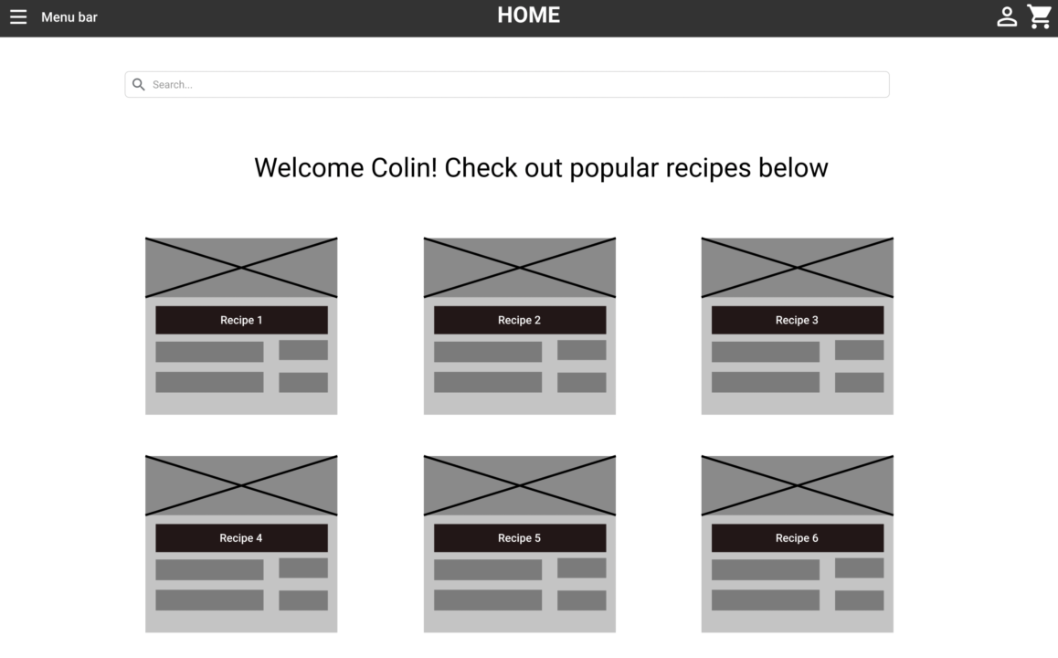
Once users have signed up they will be taken to the Home Screen with popular recipes.
They can scroll on this page or search for recipes using the search bar at the top.
The recipe cards will include a picture, recipe name, and important info on each of the meals.
When the user clicks on a recipe that interests them they will be taken to that specific recipe page.
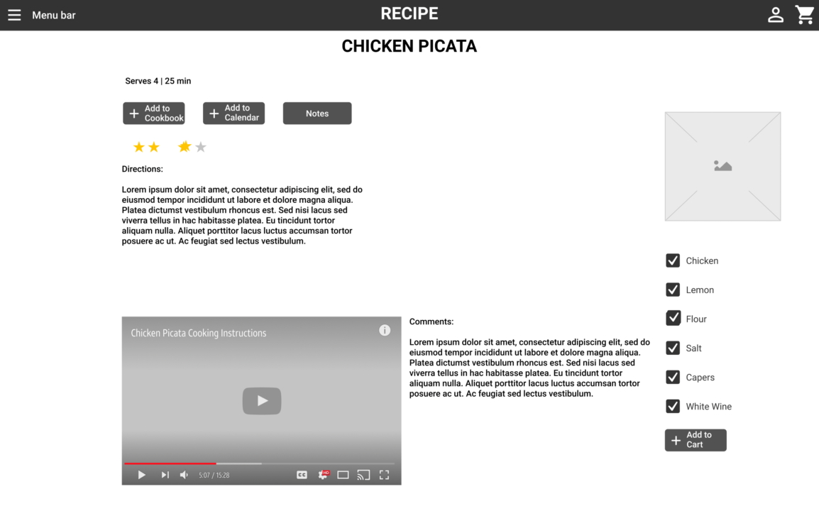
The recipe page includes a lot of features that allows the user to customize each and every meal they create.
They are able to add it to their cookbook for future reference, add it to their calendar so they can plan out which meals will be cooked on each day, and add specific notes for the next time they cook this recipe.
Many people are visual learners when cooking meals so each recipe includes a video tutorial with written directions as well.
The ingredients list can be added to their cart and have those items shipped to their home.
The recipe can be saved for later and posted on their profile for others to see.
Integrating a social media feature into this platform was a mentioned several times by the users I interviewed.
The ability to set specific diets, interests, and favorite places to shop will give more specific recipe recommendations and allow others to see what recipes you are interested in cooking.
You can create your own recipes as well as adding Munch recipes to your profile.
These were a few of the important features I was able to add to the four low-fidelity designs.
I took these designs and iterated them into high-fidelity mobile designs which I will elaborate on in the next session.
Wireframes
At the beginning of my design process I created wireframes of the above designs for testing purposes.
I applied my research understandings to see my ideas come to life in the form of interactive prototypes.
I used usertesting.com to test the wireframes.
Once I tested out the usability mistakes, I started designing the high-fidelity screens in Figma.
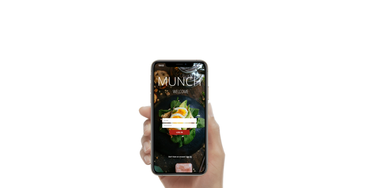
The login screen contains the fields for users to input their email and password.
I placed the meal picture in the background with the application name at the top.
I used the color red throughout the wireframe for active buttons so users can easily navigate the app.
Once the fields are filled the user will be taken to the recipe page.
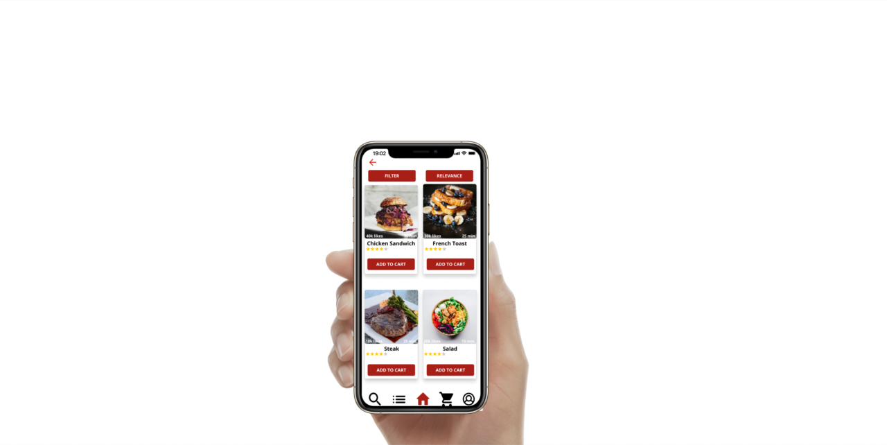
The user will be able to see four recipes at a time while they scroll the recipe page.
I moved the search bar from the top to a button on the bottom navigation bar.
The current page will be highlighted in red on the bottom of the screen.
Filters can be applied at the top for which types of recipes they would like to see.
Information about the recipes are on the cards including the cook time, likes, and rating.
The user can click on the picture to see the recipe or click the red button on the card to add the ingredients to their cart.
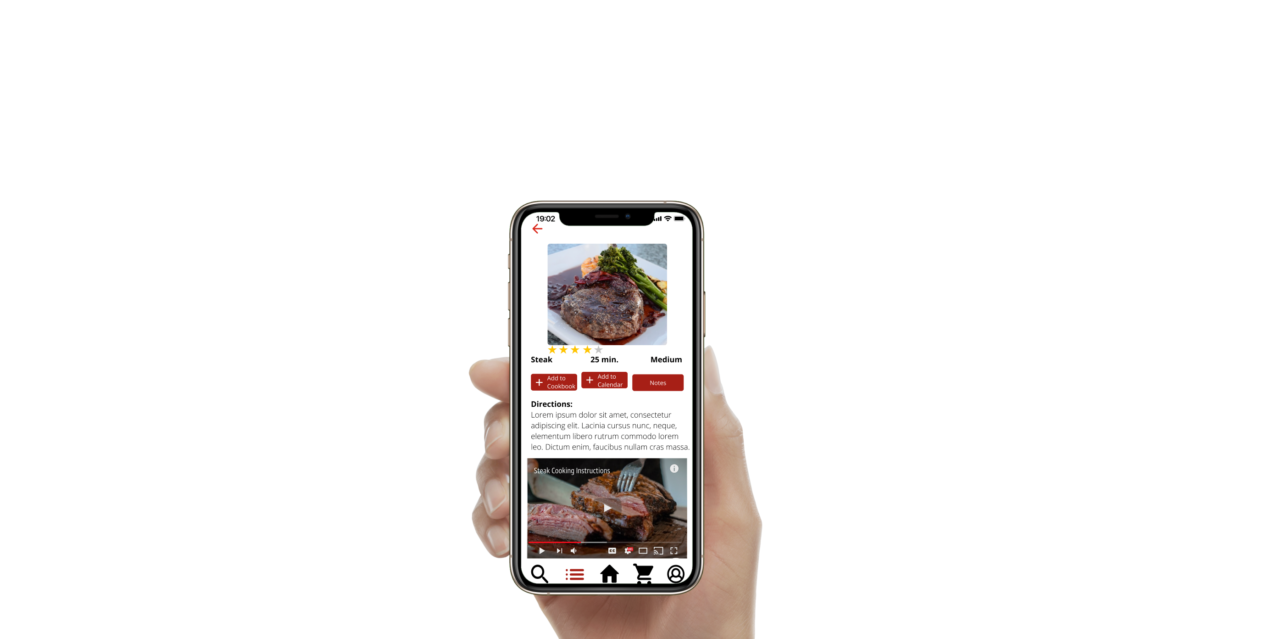
The information from the home page will be carried over to the recipe page.
The user can interact with the recipe and make the necessary changes.
They will be able to add this to their profile and share it with their friends.
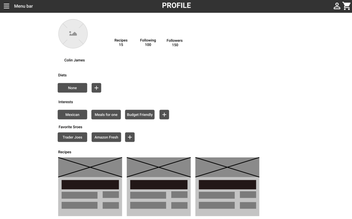
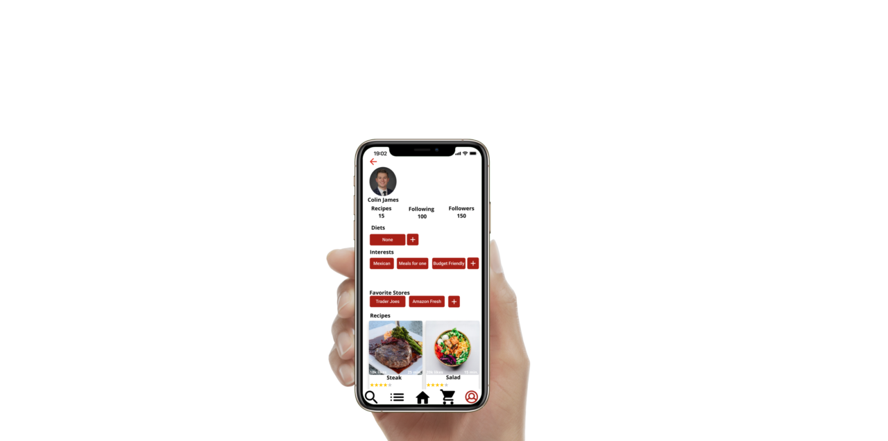
The layout of the profile page is similar to many social media networks.
The users will be able to see the amount of recipes they saved and their followers.
They will be able to add to their diet, interests, and store lists for others to see.
These high-fidelity designs were enjoyed by users and they enjoyed the intuitive experience.
The recipes are the focus of the platform and this was easily conveyed through my design choices.
Allowing customers to create a recipe book, easily order ingredients, and share recipes with other is a platform that chefs want and enjoy using.
The next steps on this project include the app development and turning this prototype into a working application.
Key Takeaways
Cooks would enjoy an online grocery shopping platform that easily integrates recipes into the shopping experience.
Using the design principles I learned in the course I was able to develop an application that met and exceeded the user needs.
Certain features like social media sharing, quick add to cart, and a profile page were ideated during the user interviews and added to the final designs.
I was able to take my idea and validate my concepts and implementation by taking my designs out for usability studies.
I improved on the design from what I learned from potential users and kept improving the product.